Bivariate
A bivariate analysis differs from a univariate, or distribution analysis, in that it is the analysis of two separate sets of data. These two sets of data are compared to one another to check for correlation, or a tendency of one of the sets of data to “predict” corresponding values in the other data set. If a linear or higher order model can be applied to describe, or model, the two sets of data, they are said to be correlated.
When two distributions are correlated, it is possible that the data in one of the distributions can be used to predict a corresponding value in the second distribution. This first distribution is referred to as the predictor and the second distribution as the response. Both predictor and response are graphed by a scatter plot, typically with the predictor on the x-axis and the response on the y-axis.
Note
Just because two sets of data correlate with one another does not necessarily mean that one predicts the other. It merely means it’s a possibility that one predicts the other. This is summarized by the saying “Correlation does not imply causation.” Use caution when drawing conclusions of a bivariate analysis. It is a good idea to study both data sets more carefully to determine if the two data sets are in fact correlated.
Interpreting the Graphs
Let’s first import sci-analysis and setup some variables to use in these examples.
import numpy as np
import scipy.stats as st
from sci_analysis import analyze

%matplotlib inline
# Create x-sequence and y-sequence from random variables.
np.random.seed(987654321)
x_sequence = st.norm.rvs(2, size=2000)
y_sequence = np.array([x + st.norm.rvs(0, 0.5, size=1) for x in x_sequence])
Scatter Plot
A scatter plot is used in sci-analysis to visualize the correlation between two sets of data. For this to work, each value in the first set of data has a corresponding value in the second set of data. The two values are tied together by the matching index value in each set of data. The length of each set of data have to be equal to one another, and the index values of each data set have to contiguous. If there is a missing value or values in one data set, the matching value at the same index in the other data set will be dropped.
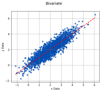
By default, the best-fit line (assuming a linear relationship) is drawn as a dotted red line.
analyze(x_sequence, y_sequence)

Linear Regression
-----------------

n         =  2000
Slope     =  1.0059
Intercept = -0.0133
r         =  0.8974
r^2       =  0.8054
Std Err   =  0.0111
p value   =  0.0000


Pearson Correlation Coefficient
-------------------------------

alpha   =  0.0500
r value =  0.8974
p value =  0.0000

HA: There is a significant relationship between predictor and response
Boxplot Borders
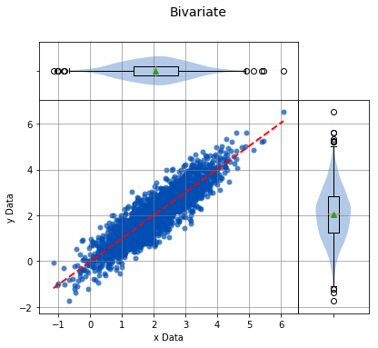
Boxplots can be displayed along-side the x and y axis of the scatter plot. This is a useful tool for visualizing the distribution of the sets of data on the x and y axis while still displaying the scatter plot.
analyze(x_sequence, y_sequence, boxplot_borders=True)

Linear Regression
-----------------

n         =  2000
Slope     =  1.0059
Intercept = -0.0133
r         =  0.8974
r^2       =  0.8054
Std Err   =  0.0111
p value   =  0.0000


Pearson Correlation Coefficient
-------------------------------

alpha   =  0.0500
r value =  0.8974
p value =  0.0000

HA: There is a significant relationship between predictor and response
Contours
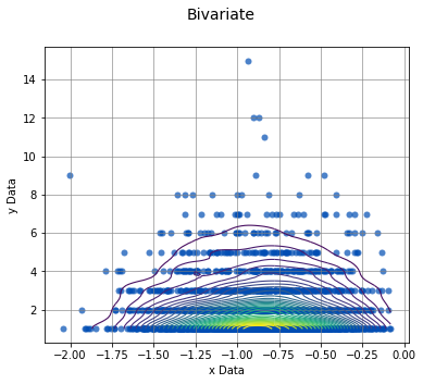
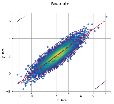
In certain cases, such as when one of the sets of data is discrete and the other is continuous, it might be difficult to determine where the data points are centered. In this case, density contours can be used to help visualize the join probability distribution between the two sets of data.
x_continuous = st.weibull_max.rvs(2.7, size=2000)
y_discrete = st.geom.rvs(0.5, loc=0, size=2000)
analyze(x_continuous, y_discrete, contours=True, fit=False)
Linear Regression
-----------------

n         =  2000
Slope     =  0.0209
Intercept =  2.0554
r         =  0.0048
r^2       =  0.0000
Std Err   =  0.0964
p value   =  0.8285


Spearman Correlation Coefficient
--------------------------------

alpha   =  0.0500
r value =  0.0019
p value =  0.9320

H0: There is no significant relationship between predictor and response
Grouped Scatter Plot
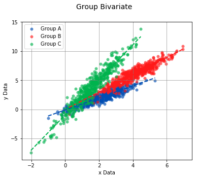
If each set of data contains discrete and equivalent groups, the scatter plot can show each group in a separate color.
# Create new x-grouped and y-grouped from independent groups A, B, and C.
a_x = st.norm.rvs(2, size=500)
a_y = np.array([x + st.norm.rvs(0, 0.5, size=1) for x in a_x])

b_x = st.norm.rvs(4, size=500)
b_y = np.array([1.5 * x + st.norm.rvs(0, 0.65, size=1) for x in b_x])

c_x = st.norm.rvs(1.5, size=500)
c_y = np.array([3 * x + st.norm.rvs(0, 0.95, size=1) - 1 for x in c_x])

x_grouped = np.concatenate((a_x, b_x, c_x))
y_grouped = np.concatenate((a_y, b_y, c_y))

grps = np.concatenate((['Group A'] * 500, ['Group B'] * 500, ['Group C'] * 500))
analyze(
    x_grouped,
    y_grouped,
    groups=grps,
    boxplot_borders=False,
)
Linear Regression
-----------------

n             Slope         Intercept     r^2           Std Err       p value       Group
--------------------------------------------------------------------------------------------------
500            1.0349       -0.0855        0.8042        0.0229        0.0000       Group A
500            1.4852        0.0162        0.8612        0.0267        0.0000       Group B
500            3.0115       -0.9385        0.9135        0.0415        0.0000       Group C


Pearson Correlation Coefficient
-------------------------------

n             r value       p value       Group
--------------------------------------------------------
500            0.8968        0.0000       Group A
500            0.9280        0.0000       Group B
500            0.9558        0.0000       Group C
Interpreting the Statistics
Linear Regression
The Linear Regression finds the least-squares best-fit line between the predictor and response. The linear relationship between the predictor and response is described by the relationship y = mx + b, where x is the predictor, y is the response, m is the slope, and b is the y-intercept.
- n - The number of data points in the analysis.
- Slope - The slope of the best-fit line between predictor and response.
- Intercept - The y-intercept of the best-fit line between predictor and response.
- r - The correlation coefficient of the linear regression.
- r^2 - The amount of error that can be described by the linear regression. The higher the number, the more accurate the linear regression models the relationship between the predictor and response.
- Std Err - Standard error of the best-fit line.
- p value - The p value of the hypothesis test that the slope of the best-fit line is actually zero.
Correlation Coefficient
If the data points from both sets of data are normally distributed, the Pearson correlation coefficient is calculated, otherwise, the Spearman Rank correlation coefficient is calculated. A correlation coefficient of 0 indicates no relationship, whereas 1 indicates a perfect correlation between predictor and response. In the case of both correlation coefficients, the null hypothesis is that the correlation coefficient is 0, signifying no relationship between the predictor and response. If the p value is less than the significance $alpha$, the predictor and response are correlated.
Usage
-
analyze(x-sequence, y-sequence[, fit=True, points=True, boxplot_borders=True, contours=False, labels=None, highlight=None, title=’Bivariate’, xname=’x Data’, yname=’y Data’, save_to=None])¶ Perform a Bivariate analysis on x-sequence and y-sequence.
Parameters: - x-sequence (array-like) – The array-like object on the x-axis (Predictor) to analyze. It can be a list, tuple, numpy array or pandas Series of numeric values.
- y-sequence (array-like) – The array-like object on the y-axis (Response) to analyze. It can be a list, tuple, numpy array or pandas Series of numeric values. The length of y-sequence should match the length of x-sequence.
- groups (array-like) – An array-like object of string values that correspond to groups to individually analyze. The length of groups should match the length of x-sequence and y-sequence.
- fit (bool) – Display the best fit line if True.
- points (bool) – Display the points on the scatter plot if True.
- boxplot_borders (bool) – Display boxplots along the x and y axis of the scatter plot if True.
- contours (bool) – Display the density contour lines on the scatter plot if True.
- labels (array-like) – Labels that identify the x and y data points in x-sequence and y-sequence. The length of labels should match the length of x-sequence and y-sequence.
- highlight (array-like) – A sequence of x and y data point labels to highlight on the scatter plot or a sequence of group names to highlight on the scatter plot. All other points will appear transparent on the scatter plot.
- title (str) – The title of the graph.
- xname (str) – The label of the x-axis of the scatter plot.
- yname (str) – The label of the y-axis of the scatter plot.
Argument Examples
x-sequence, y-sequence
The bare minimum requirements for performing a Bivariate analysis. The length of x-sequence and y-sequence should be equal and will raise an UnequalVectorLengthError if not.
analyze(
    x_sequence,
    y_sequence,
)
Linear Regression
-----------------

n         =  2000
Slope     =  1.0059
Intercept = -0.0133
r         =  0.8974
r^2       =  0.8054
Std Err   =  0.0111
p value   =  0.0000


Pearson Correlation Coefficient
-------------------------------

alpha   =  0.0500
r value =  0.8974
p value =  0.0000

HA: There is a significant relationship between predictor and response
fit
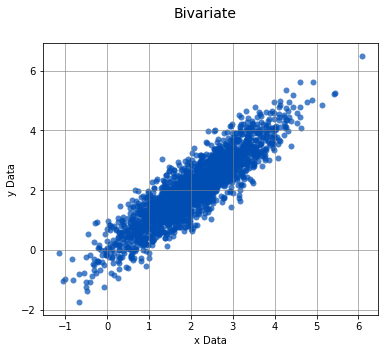
Controls whether the best fit line is displayed or not.
analyze(
    x_sequence,
    y_sequence,
    fit=False,
)
Linear Regression
-----------------

n         =  2000
Slope     =  1.0059
Intercept = -0.0133
r         =  0.8974
r^2       =  0.8054
Std Err   =  0.0111
p value   =  0.0000


Pearson Correlation Coefficient
-------------------------------

alpha   =  0.0500
r value =  0.8974
p value =  0.0000

HA: There is a significant relationship between predictor and response
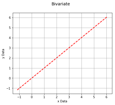
points
Controls whether the data points of the scatter plot are displayed or not.
analyze(
    x_sequence,
    y_sequence,
    points=False,
)
Linear Regression
-----------------

n         =  2000
Slope     =  1.0059
Intercept = -0.0133
r         =  0.8974
r^2       =  0.8054
Std Err   =  0.0111
p value   =  0.0000


Pearson Correlation Coefficient
-------------------------------

alpha   =  0.0500
r value =  0.8974
p value =  0.0000

HA: There is a significant relationship between predictor and response
boxplot_borders
Controls whether boxplots are displayed for x-sequence and y-sequence.
analyze(
    x_sequence,
    y_sequence,
    boxplot_borders=True,
)
Linear Regression
-----------------

n         =  2000
Slope     =  1.0059
Intercept = -0.0133
r         =  0.8974
r^2       =  0.8054
Std Err   =  0.0111
p value   =  0.0000


Pearson Correlation Coefficient
-------------------------------

alpha   =  0.0500
r value =  0.8974
p value =  0.0000

HA: There is a significant relationship between predictor and response
contours
Controls whether the density contours are displayed or not. The contours can be useful when analyzing joint probability distributions.
analyze(
    x_sequence,
    y_sequence,
    contours=True,
)
Linear Regression
-----------------

n         =  2000
Slope     =  1.0059
Intercept = -0.0133
r         =  0.8974
r^2       =  0.8054
Std Err   =  0.0111
p value   =  0.0000


Pearson Correlation Coefficient
-------------------------------

alpha   =  0.0500
r value =  0.8974
p value =  0.0000

HA: There is a significant relationship between predictor and response
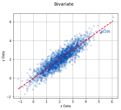
labels, highlight
Used in conjunction with one another, labels and highlight are used for displaying data values for the data points on the scatter plot.
labels = np.random.randint(low=10000, high=99999, size=2000)
analyze(
    x_sequence,
    y_sequence,
    labels=labels,
    highlight=[66286]
)
Linear Regression
-----------------

n         =  2000
Slope     =  1.0059
Intercept = -0.0133
r         =  0.8974
r^2       =  0.8054
Std Err   =  0.0111
p value   =  0.0000


Pearson Correlation Coefficient
-------------------------------

alpha   =  0.0500
r value =  0.8974
p value =  0.0000

HA: There is a significant relationship between predictor and response
groups
The groups argument can be used to perform a Bivariate analysis on separate collections of data points that can be compared to one another.
# Create new x-grouped and y-grouped from independent groups A, B, and C.
a_x = st.norm.rvs(2, size=500)
a_y = np.array([x + st.norm.rvs(0, 0.5, size=1) for x in a_x])

b_x = st.norm.rvs(4, size=500)
b_y = np.array([1.5 * x + st.norm.rvs(0, 0.65, size=1) for x in b_x])

c_x = st.norm.rvs(1.5, size=500)
c_y = np.array([3 * x + st.norm.rvs(0, 0.95, size=1) - 1 for x in c_x])

x_grouped = np.concatenate((a_x, b_x, c_x))
y_grouped = np.concatenate((a_y, b_y, c_y))

grps = np.concatenate((['Group A'] * 500, ['Group B'] * 500, ['Group C'] * 500))
analyze(
    x_grouped,
    y_grouped,
    groups=grps,
)
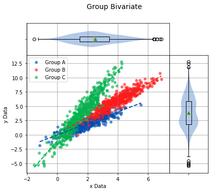
Linear Regression
-----------------

n             Slope         Intercept     r^2           Std Err       p value       Group
--------------------------------------------------------------------------------------------------
500            1.0109       -0.0389        0.7756        0.0244        0.0000       Group A
500            1.4782        0.1239        0.8339        0.0296        0.0000       Group B
500            3.0592       -1.0666        0.9084        0.0435        0.0000       Group C


Pearson Correlation Coefficient
-------------------------------

n             r value       p value       Group
--------------------------------------------------------
500            0.8807        0.0000       Group A
500            0.9132        0.0000       Group B
500            0.9531        0.0000       Group C
groups, highlight
Using the groups argument is a great way to compare treatments. When combined with the highlight argument, a particular group can be highlighted on the scatter plot to stand out from the others.
analyze(
    x_grouped,
    y_grouped,
    groups=grps,
    highlight=['Group A'],
)
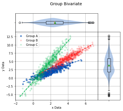
Linear Regression
-----------------

n             Slope         Intercept     r^2           Std Err       p value       Group
--------------------------------------------------------------------------------------------------
500            1.0109       -0.0389        0.7756        0.0244        0.0000       Group A
500            1.4782        0.1239        0.8339        0.0296        0.0000       Group B
500            3.0592       -1.0666        0.9084        0.0435        0.0000       Group C


Pearson Correlation Coefficient
-------------------------------

n             r value       p value       Group
--------------------------------------------------------
500            0.8807        0.0000       Group A
500            0.9132        0.0000       Group B
500            0.9531        0.0000       Group C
Multiple groups can also be highlighted.
analyze(
    x_grouped,
    y_grouped,
    groups=grps,
    highlight=['Group A', 'Group B'],
)
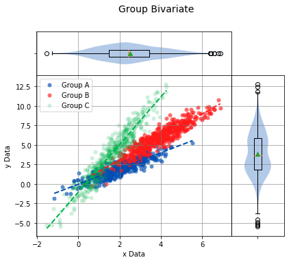
Linear Regression
-----------------

n             Slope         Intercept     r^2           Std Err       p value       Group
--------------------------------------------------------------------------------------------------
500            1.0109       -0.0389        0.7756        0.0244        0.0000       Group A
500            1.4782        0.1239        0.8339        0.0296        0.0000       Group B
500            3.0592       -1.0666        0.9084        0.0435        0.0000       Group C


Pearson Correlation Coefficient
-------------------------------

n             r value       p value       Group
--------------------------------------------------------
500            0.8807        0.0000       Group A
500            0.9132        0.0000       Group B
500            0.9531        0.0000       Group C
title
The title of the distribution to display above the graph.
x_sequence = st.norm.rvs(2, size=2000)
y_sequence = np.array([x + st.norm.rvs(0, 0.5, size=1) for x in x_sequence])
analyze(
    x_sequence,
    y_sequence,
    title='This is a Title',
)

Linear Regression
-----------------

n         =  2000
Slope     =  1.0086
Intercept = -0.0203
r         =  0.8946
r^2       =  0.8004
Std Err   =  0.0113
p value   =  0.0000


Pearson Correlation Coefficient
-------------------------------

alpha   =  0.0500
r value =  0.8946
p value =  0.0000

HA: There is a significant relationship between predictor and response
xname
The name of the data on the x-axis.
analyze(
    x_sequence,
    y_sequence,
    xname='This is the x-axis data'
)
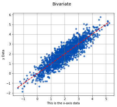
Linear Regression
-----------------

n         =  2000
Slope     =  1.0086
Intercept = -0.0203
r         =  0.8946
r^2       =  0.8004
Std Err   =  0.0113
p value   =  0.0000


Pearson Correlation Coefficient
-------------------------------

alpha   =  0.0500
r value =  0.8946
p value =  0.0000

HA: There is a significant relationship between predictor and response
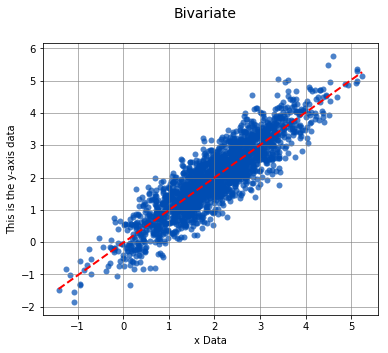
yname
The name of the data on the y-axis.
analyze(
    x_sequence,
    y_sequence,
    yname='This is the y-axis data'
)
Linear Regression
-----------------

n         =  2000
Slope     =  1.0086
Intercept = -0.0203
r         =  0.8946
r^2       =  0.8004
Std Err   =  0.0113
p value   =  0.0000


Pearson Correlation Coefficient
-------------------------------

alpha   =  0.0500
r value =  0.8946
p value =  0.0000

HA: There is a significant relationship between predictor and response